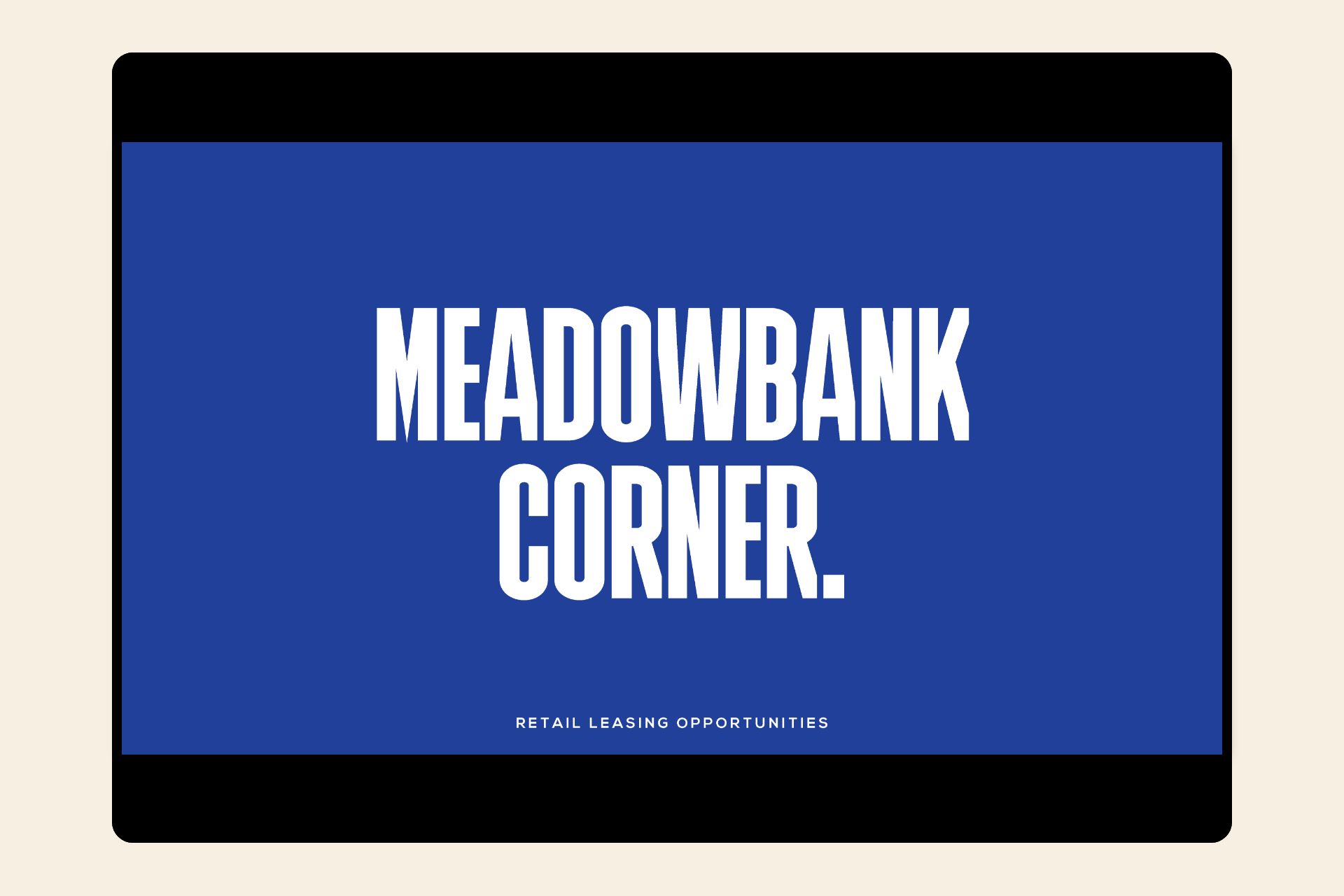
Meadowbank Corner.
Taking inspiration from the traditional neighbourhood cornerstore, Meadowbank Corner looks to bring enjoyment, ease and a distinctly local flavour back to the retail experience.
Meadowbank Corner place brand identity. Fast emerging as a driving force for change in rental living, apt.Residential are on a mission to help shape the future of home, for the better. At the heart of their human-centric design philosophy is the creation of places which enable residents to connect, bring more enjoyment and convenience into their everyday lives. With this in mind, Apt.Residential sought a creative partner who shared their ideals, to join them on this journey – Our first task was the creation of a place brand strategy for the retail component of their new $280m Meadowbank precinct. Taking inspiration from the traditional neighbourhood cornerstore, Meadowbank Corner looks to bring enjoyment, ease and a distinctly local flavour back to the retail experience.
Client
apt.Residential
Sector
Commerical & Retail
Services
Brand Strategy
Brand Identity
Digital
Environmental

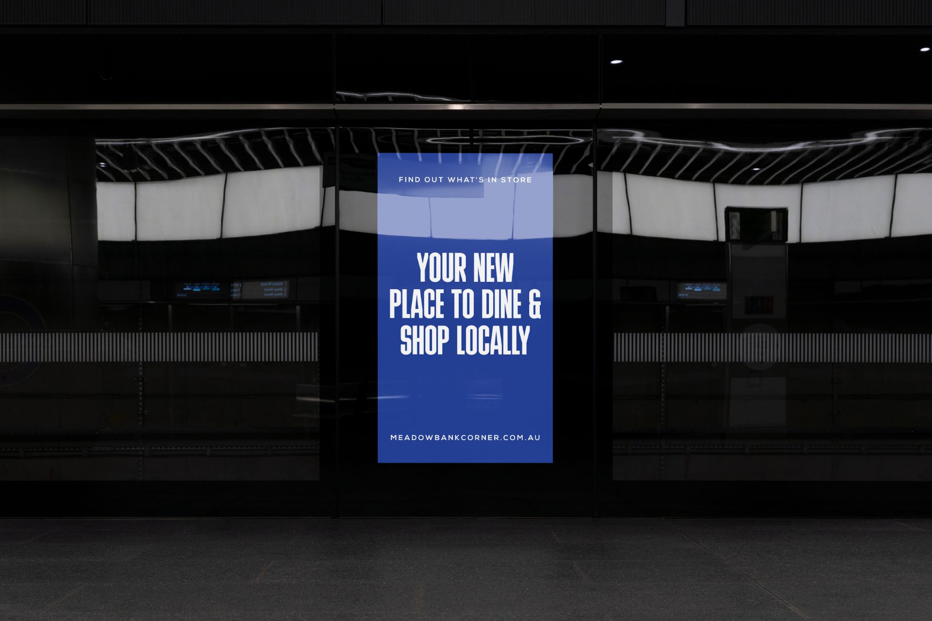
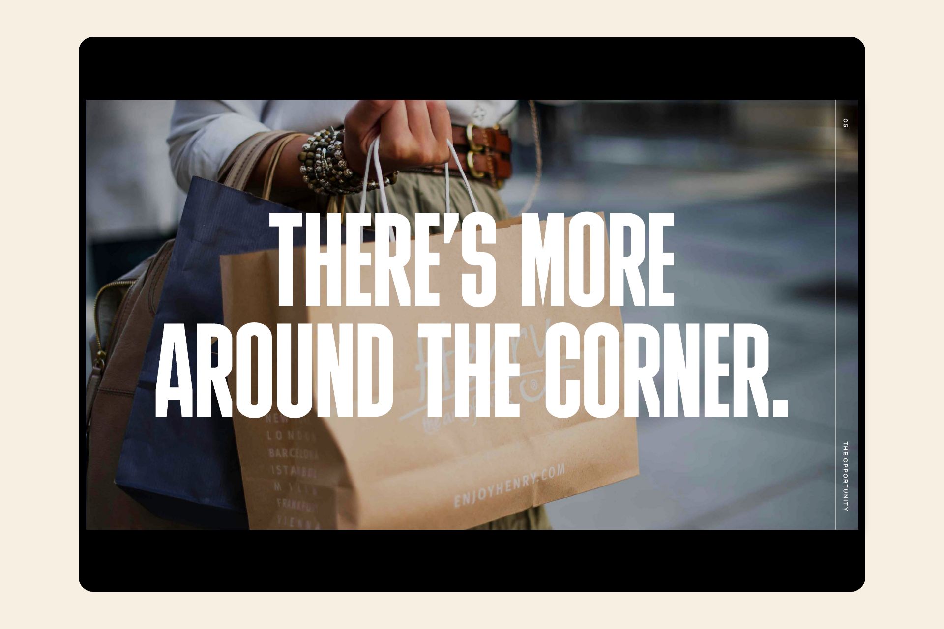
It’s all just around the corner.
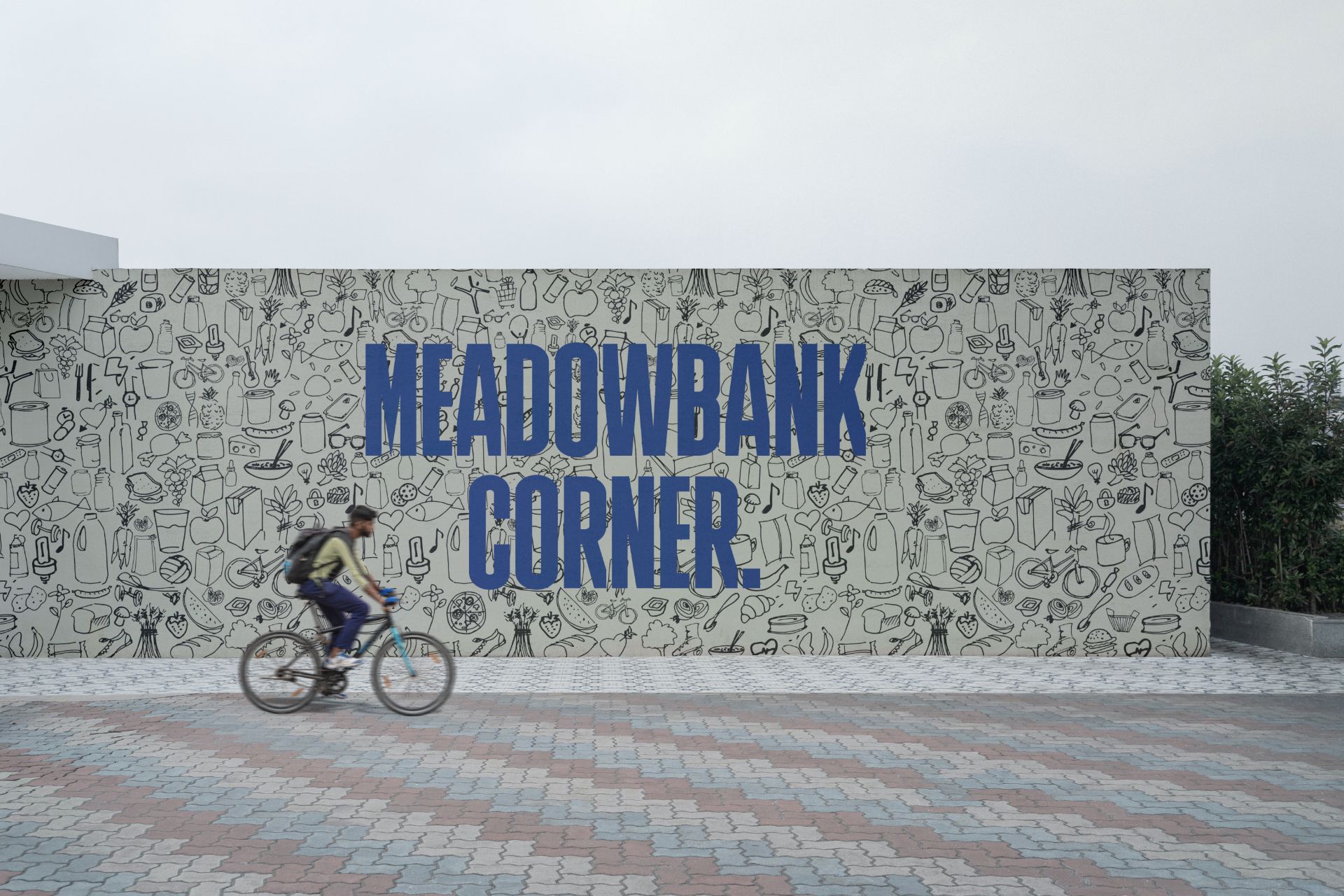
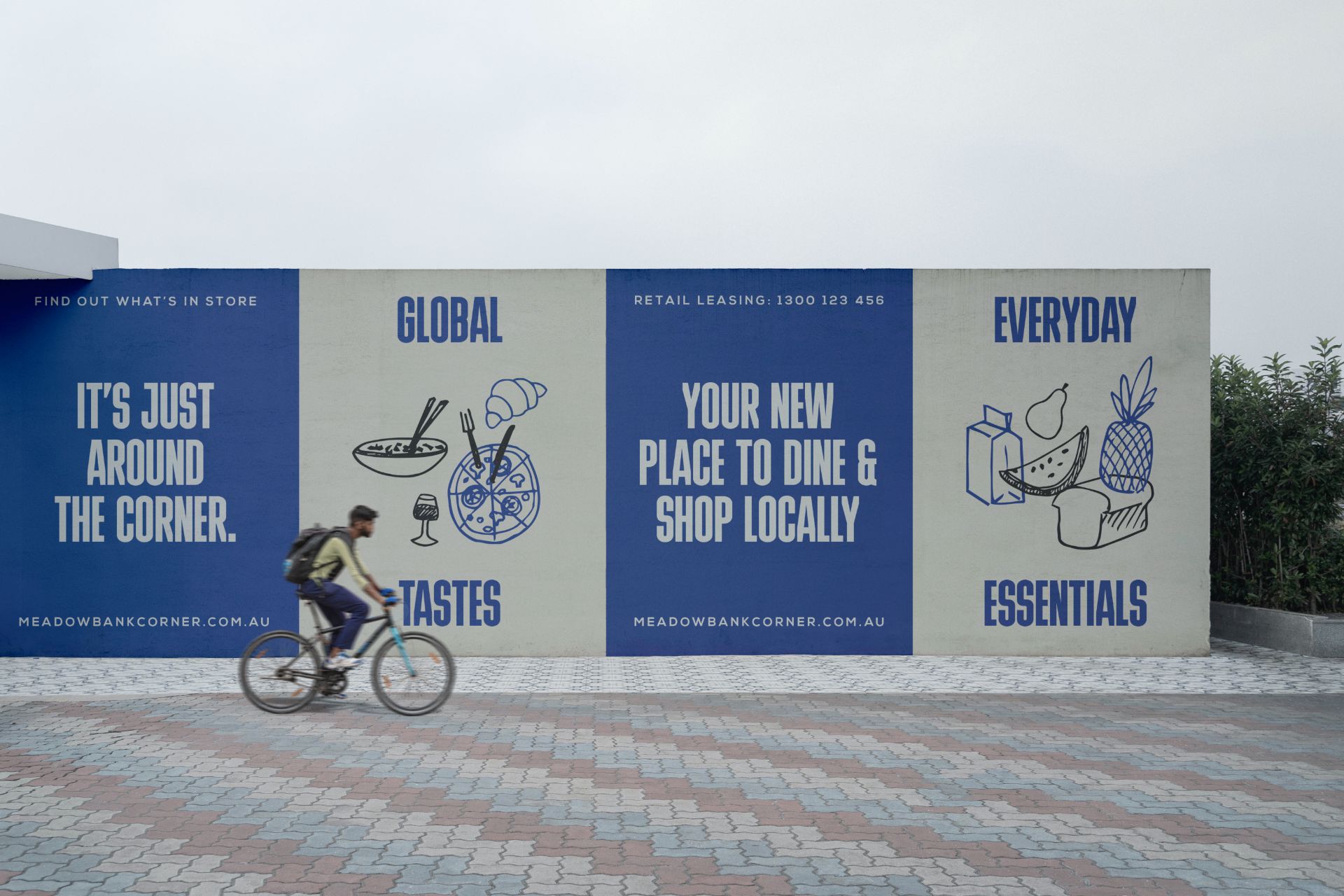
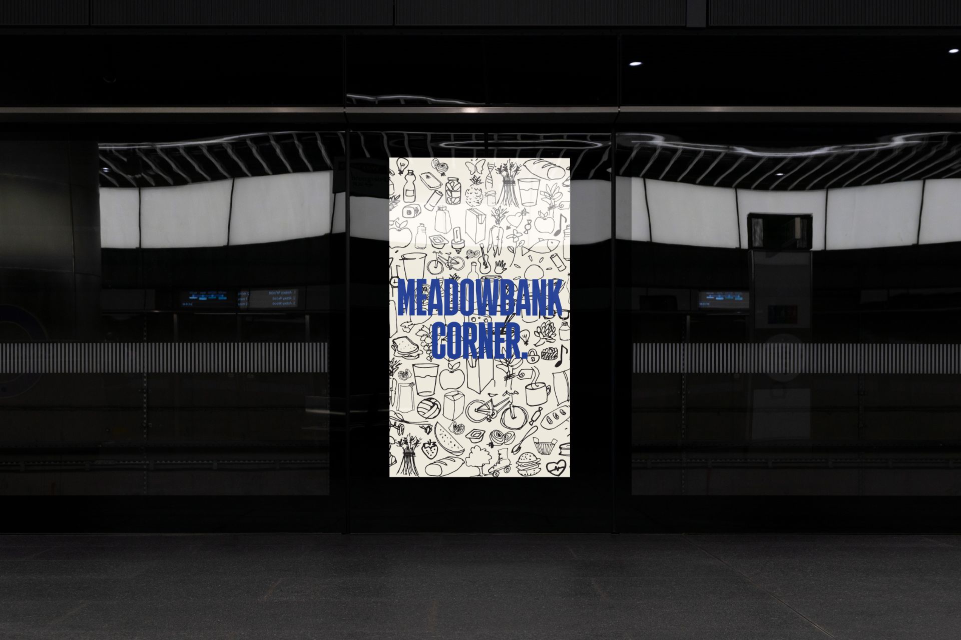
Milk bottle top blue and unapolagetically bold typography – a marriage made in heaven and perfect contrast to Meadowbank Corner’s playful lineart illustrations.


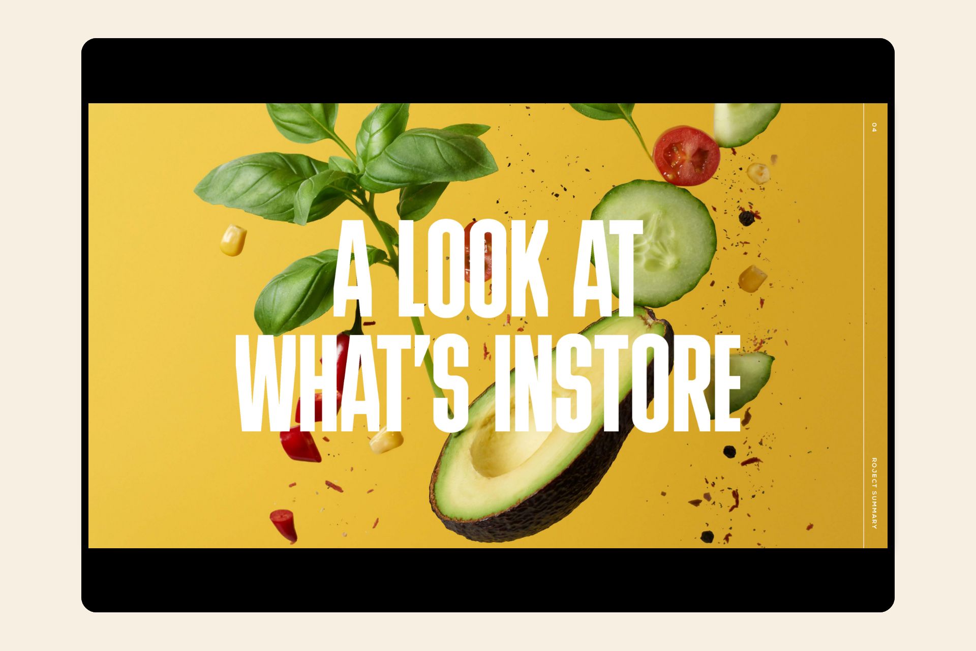
A retail hub designed around the needs of the local community.

Playful and energetic, the Meadowbank Corner brand seeks to bring a little more fun into everyday life.